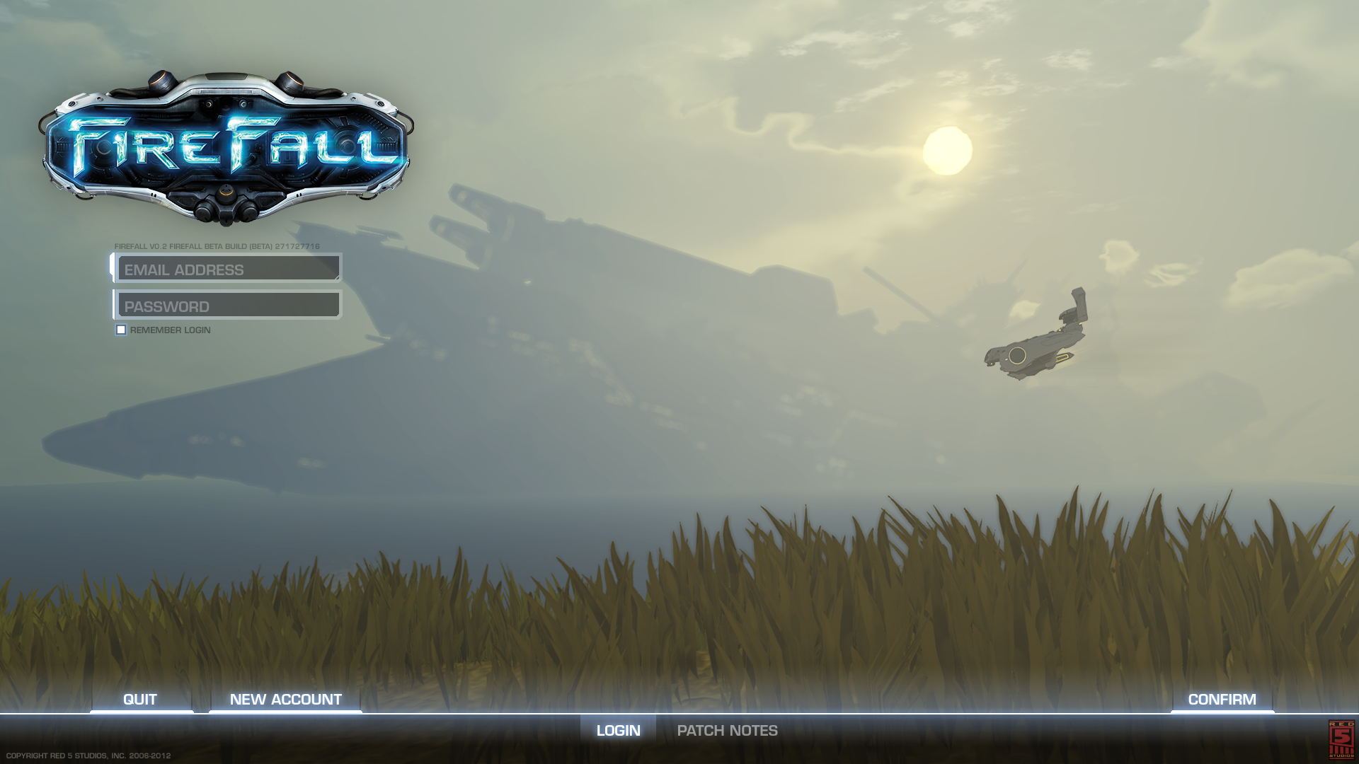
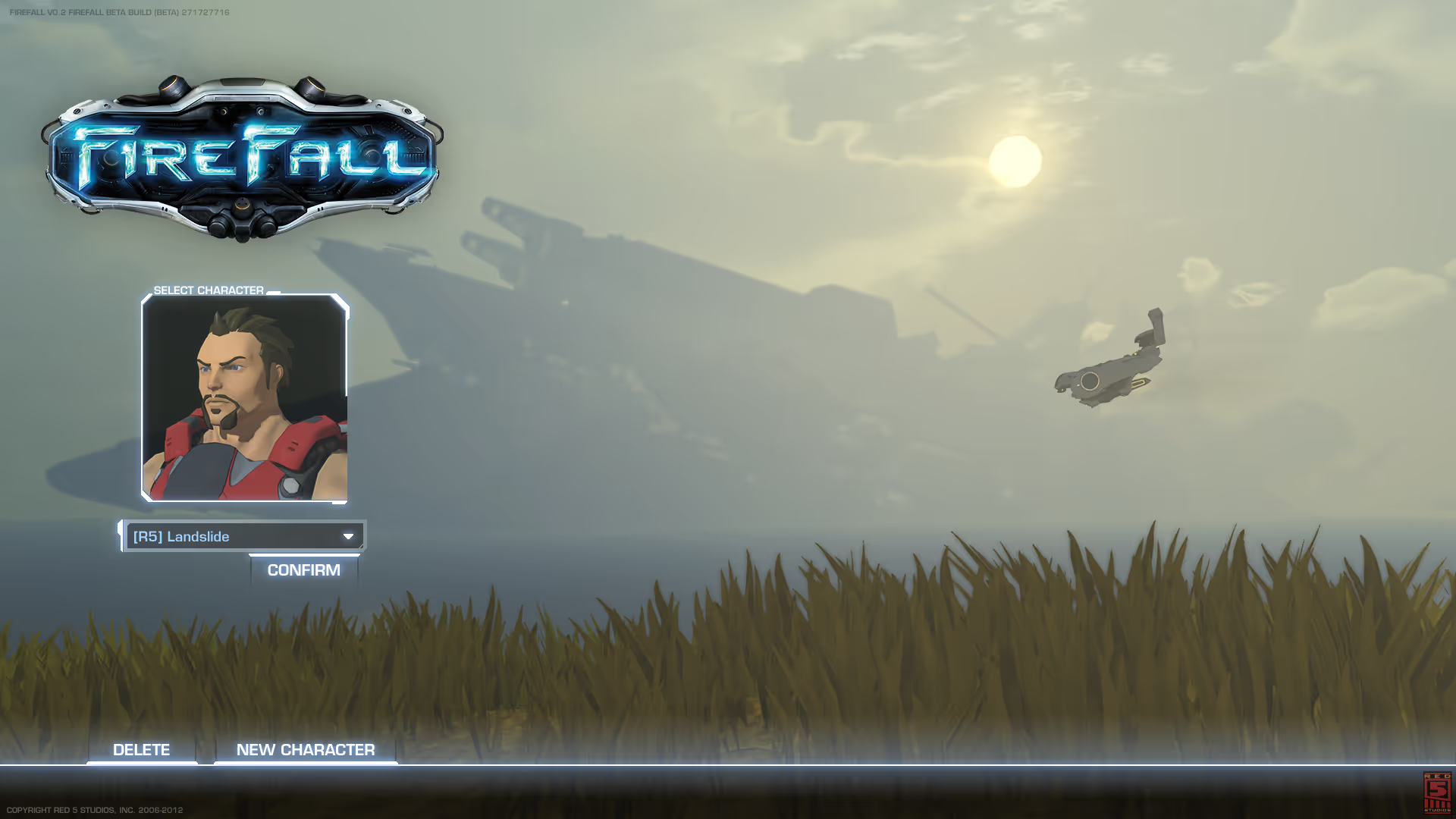
Firefall
2011-2013
Originally hired because of my decade of web-design experience, I quickly transitioned to being Red 5's full time Senior UI Designer. Firefall was another team-based game, with all the standard requirements, and loads and loads of iconography needs. I did a lot of 2D and 3D UI work on this project, but the icon work remains my favorite.
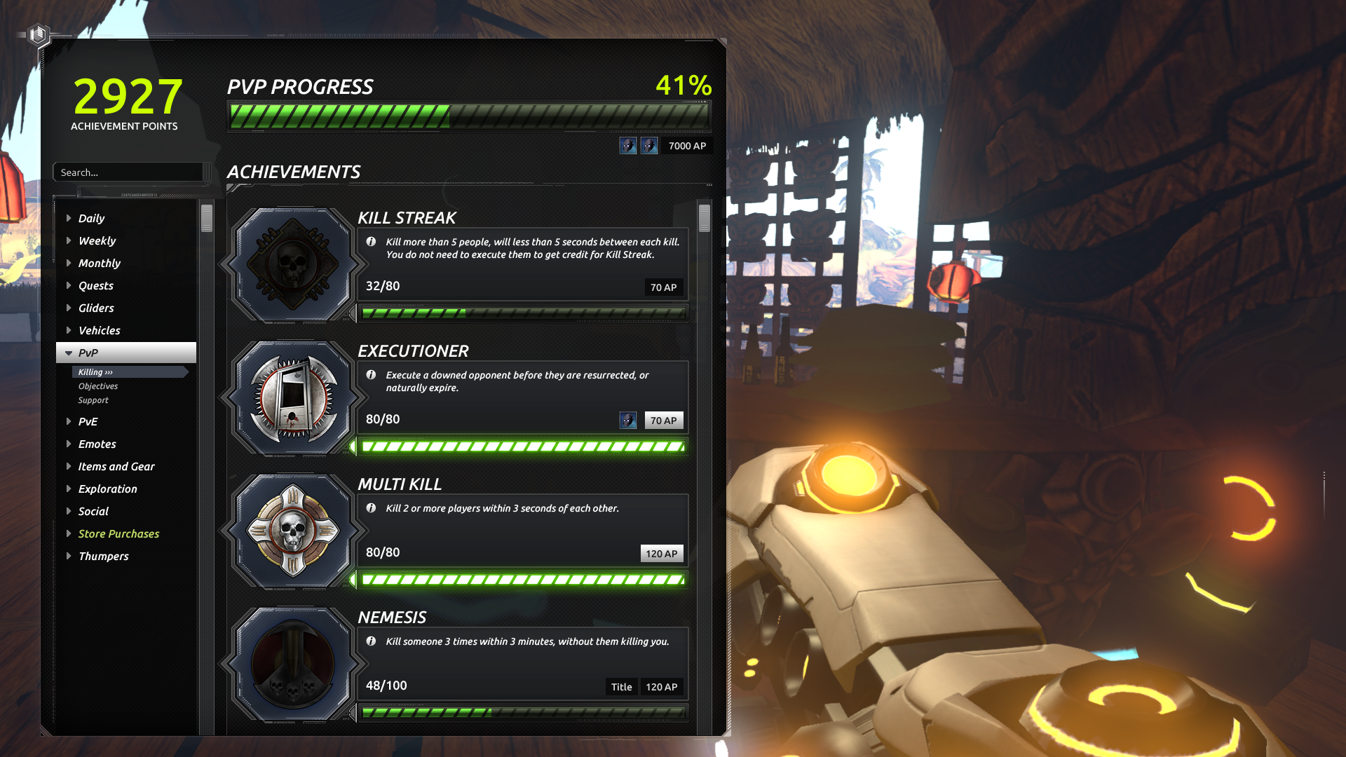
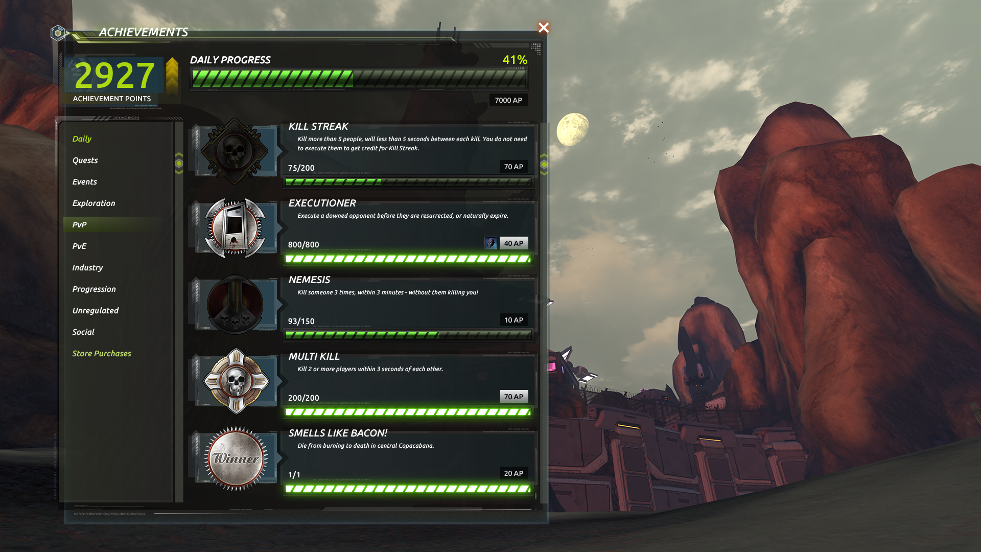
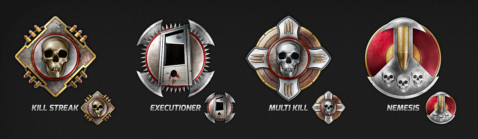
achievement ui
We wanted our achievements to be tactile--something a user could be proud to achieve, with an image they could find satisfaction in sharing and showing off.
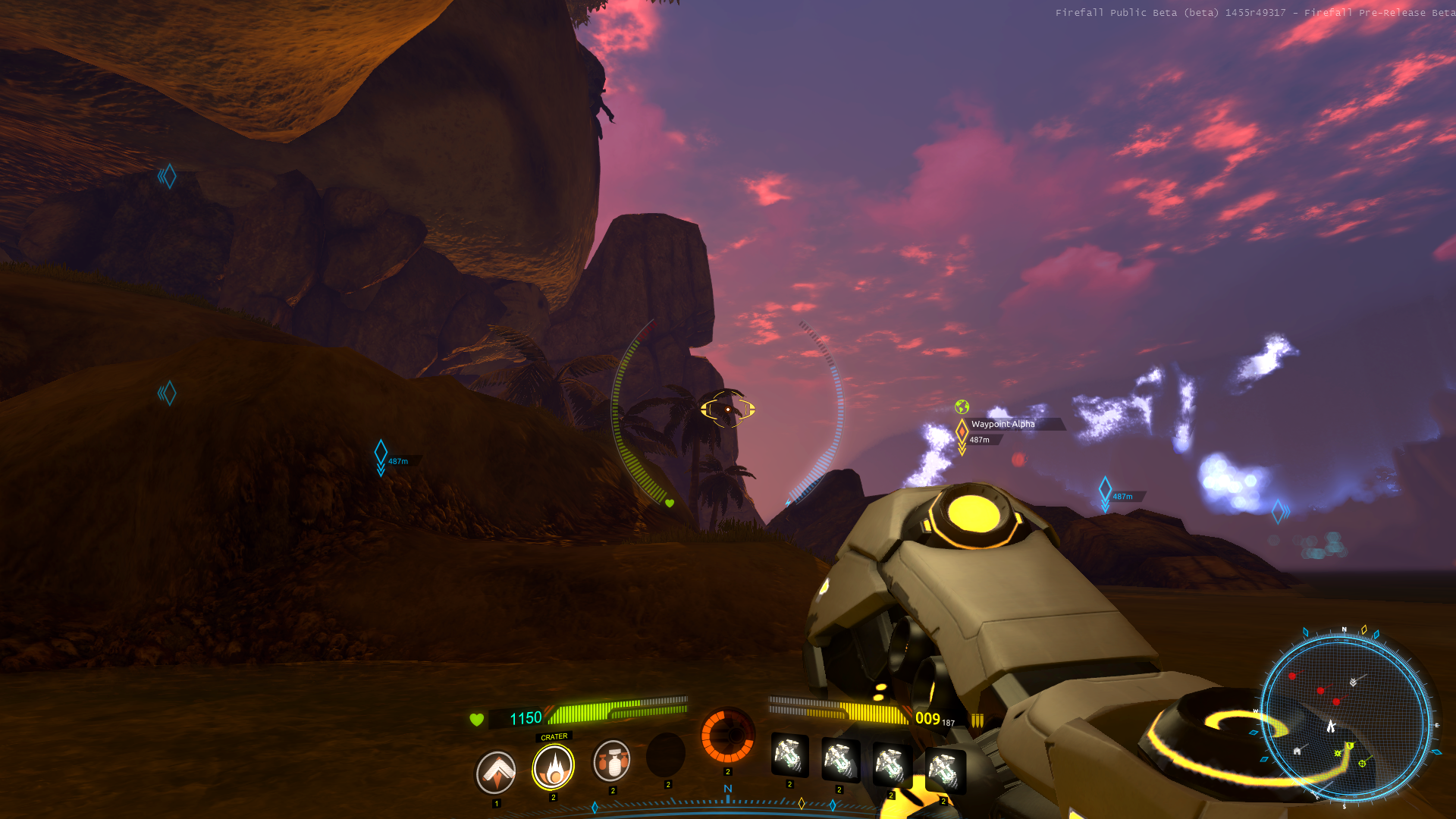
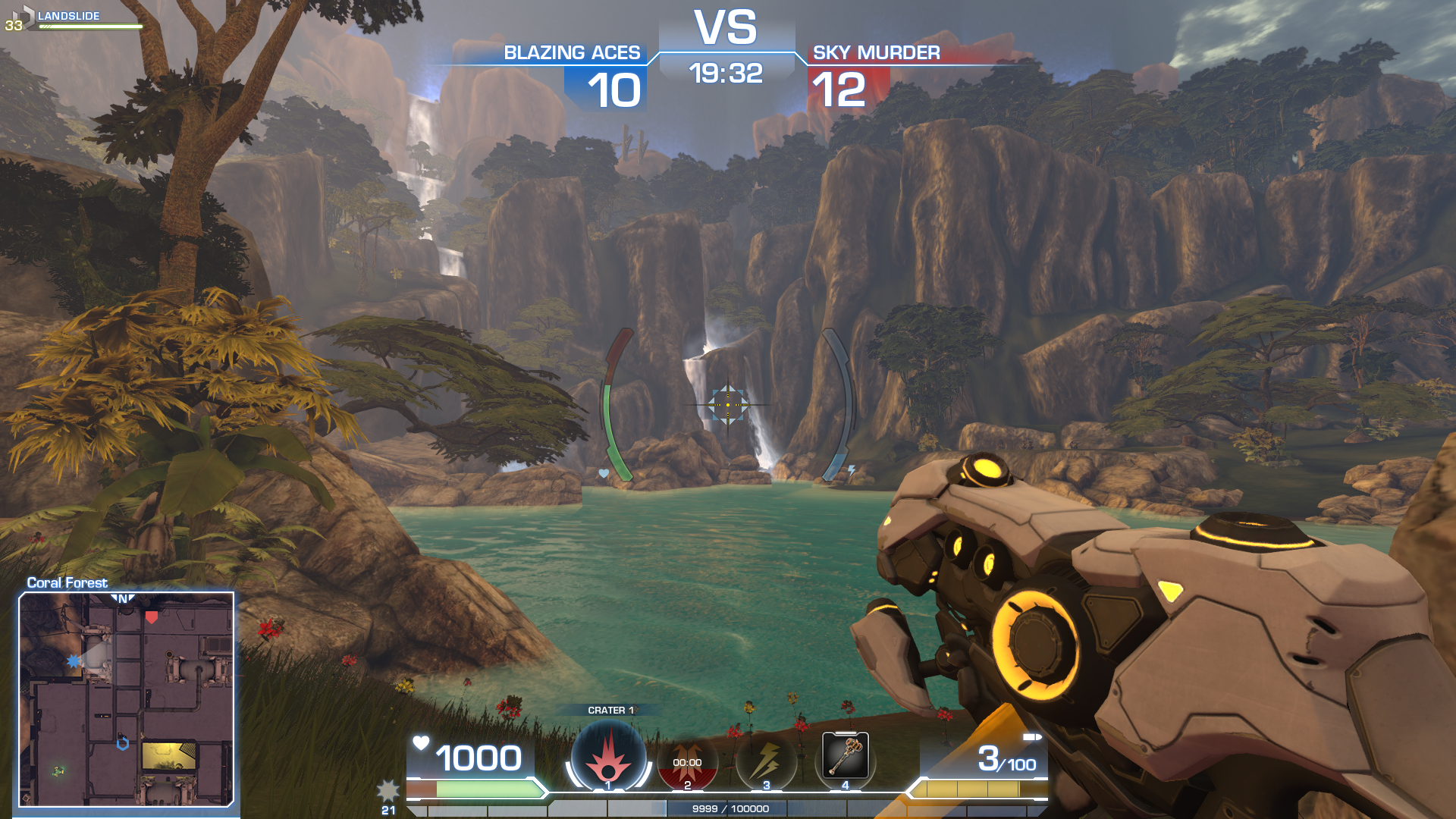
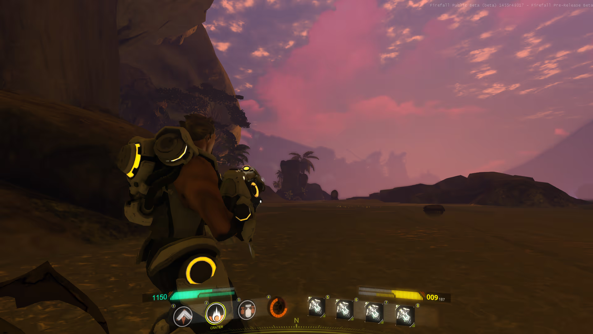
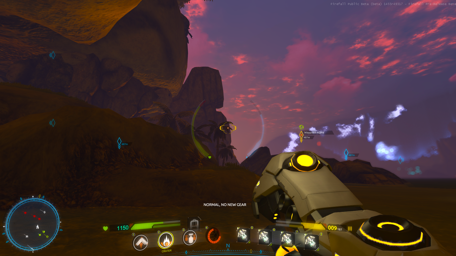
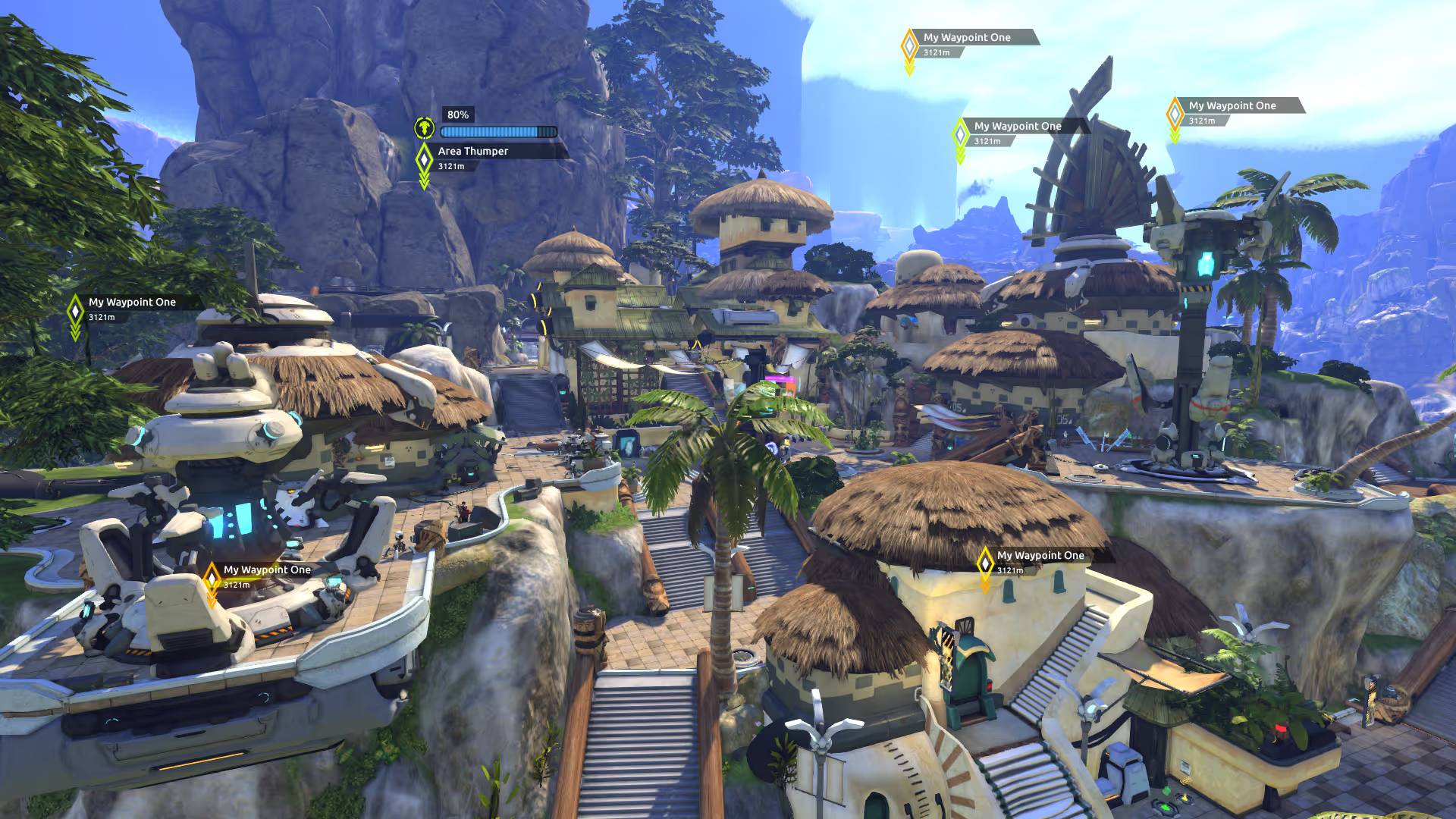
HUD ui
Under strong direction to explore 3D UI solutions, I still wanted to ensure everything was readable and usable. Often, in sci-fi, there will be a request to 'skew' UI so it looks more 3D. This can be okay if done with subtlety, but far too often such tilting, without a change in UI FOV, can diminish readability. My goal on this task was to make sure everything was still clear on screen.
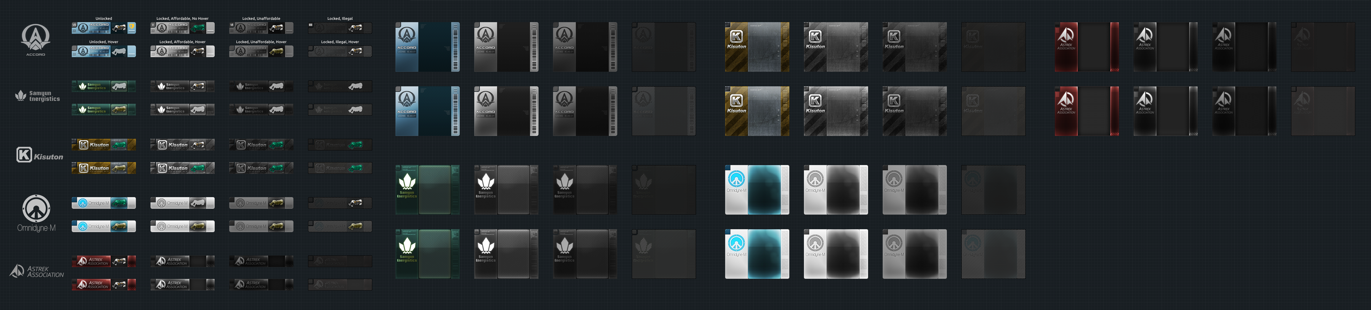
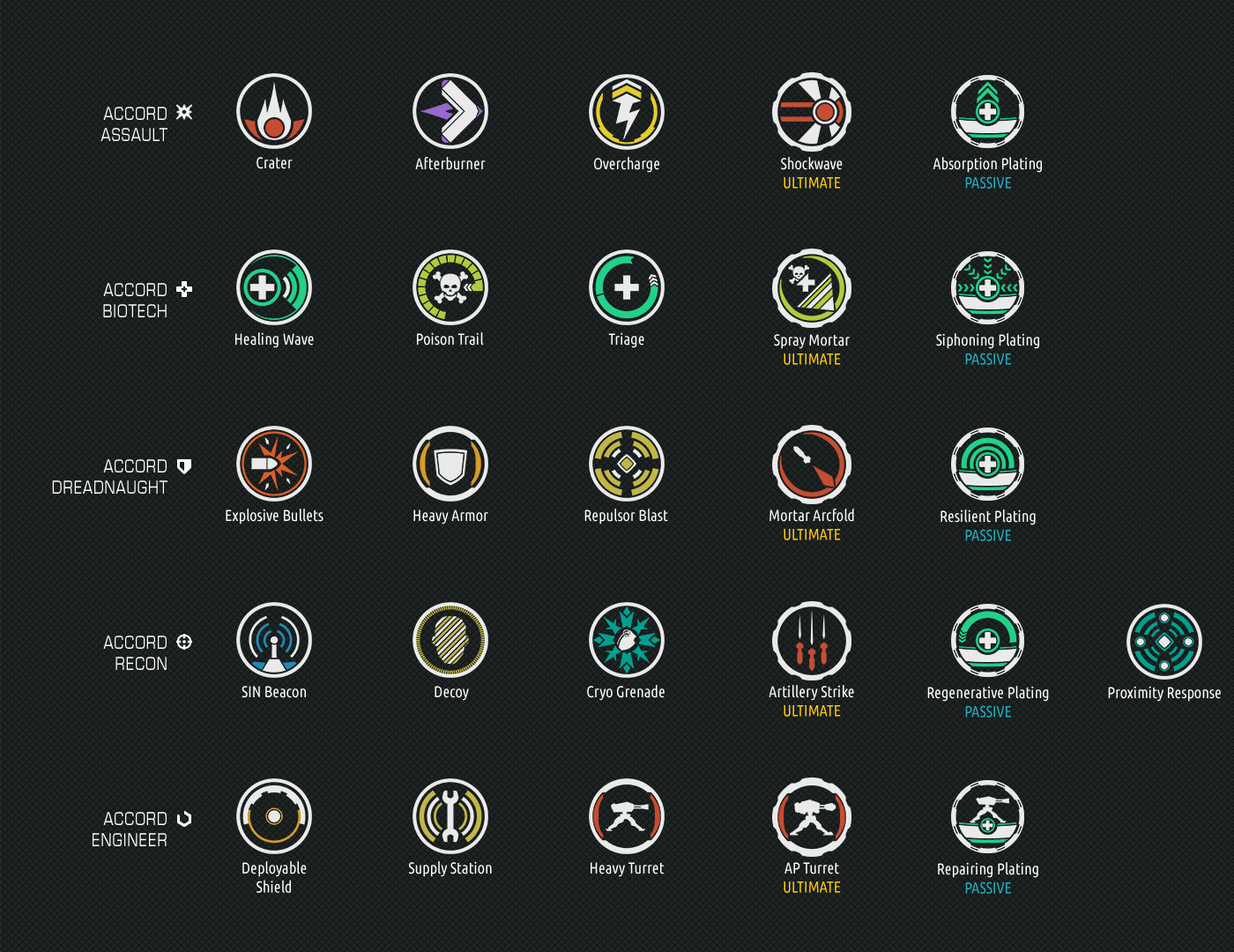
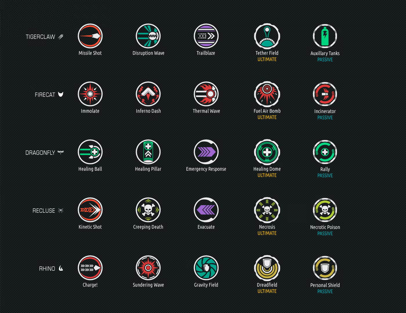
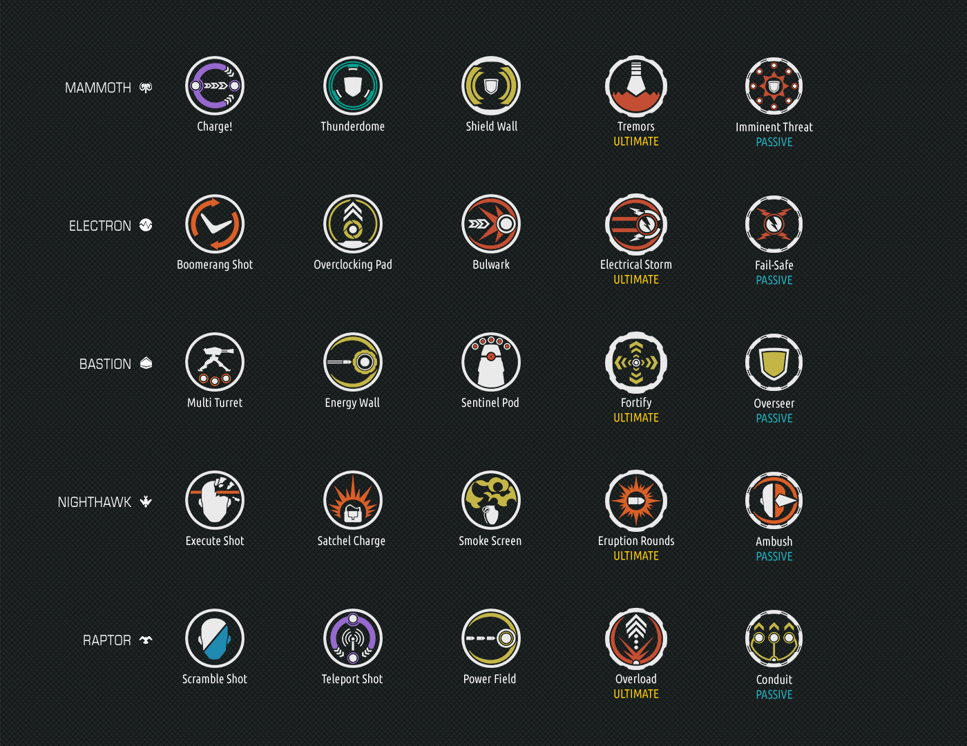
Icon designs
This is a selection of the hundreds of icons I made for the project. I like these because each set shows different categories, themes and progression, and each icon tells a story about what it does.
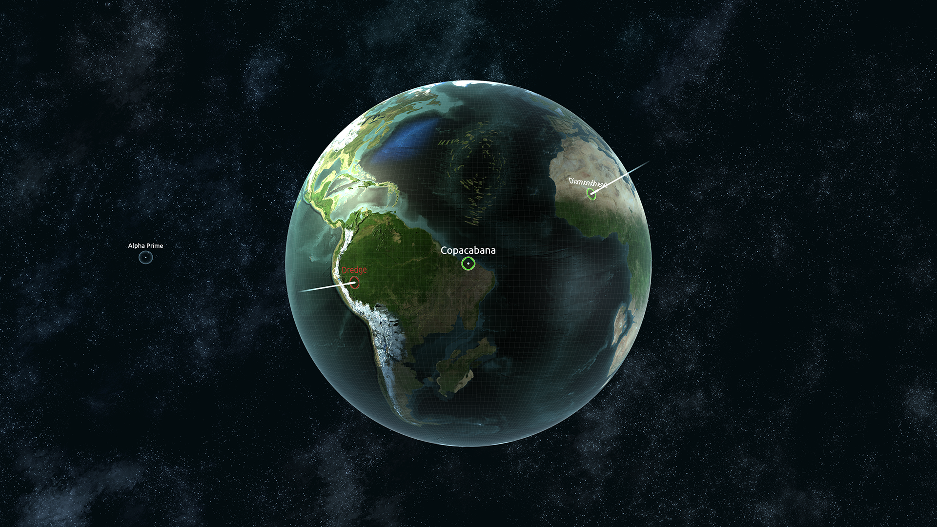
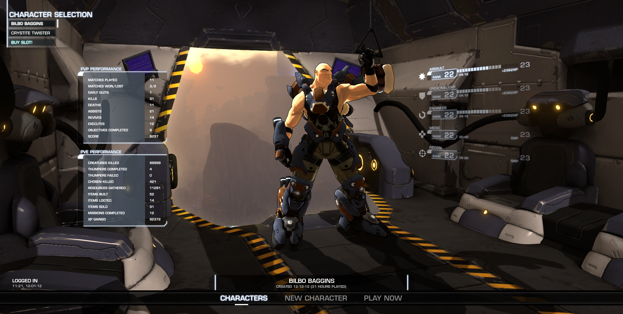
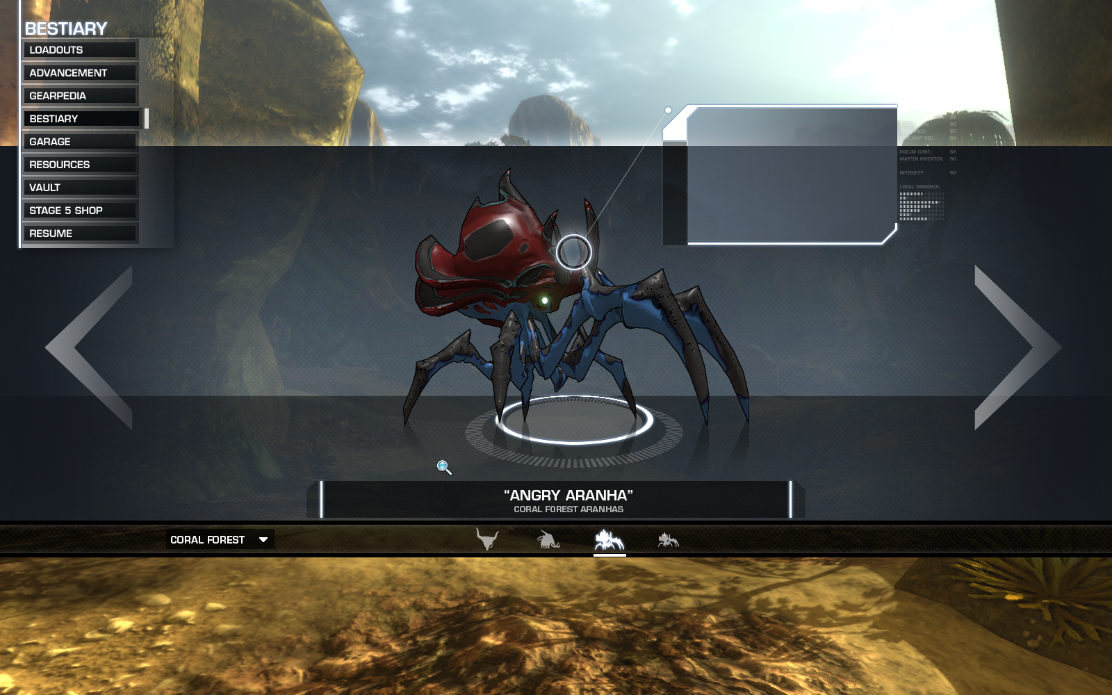
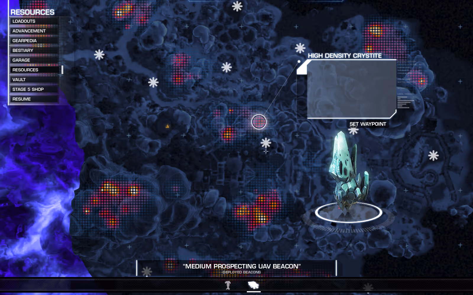
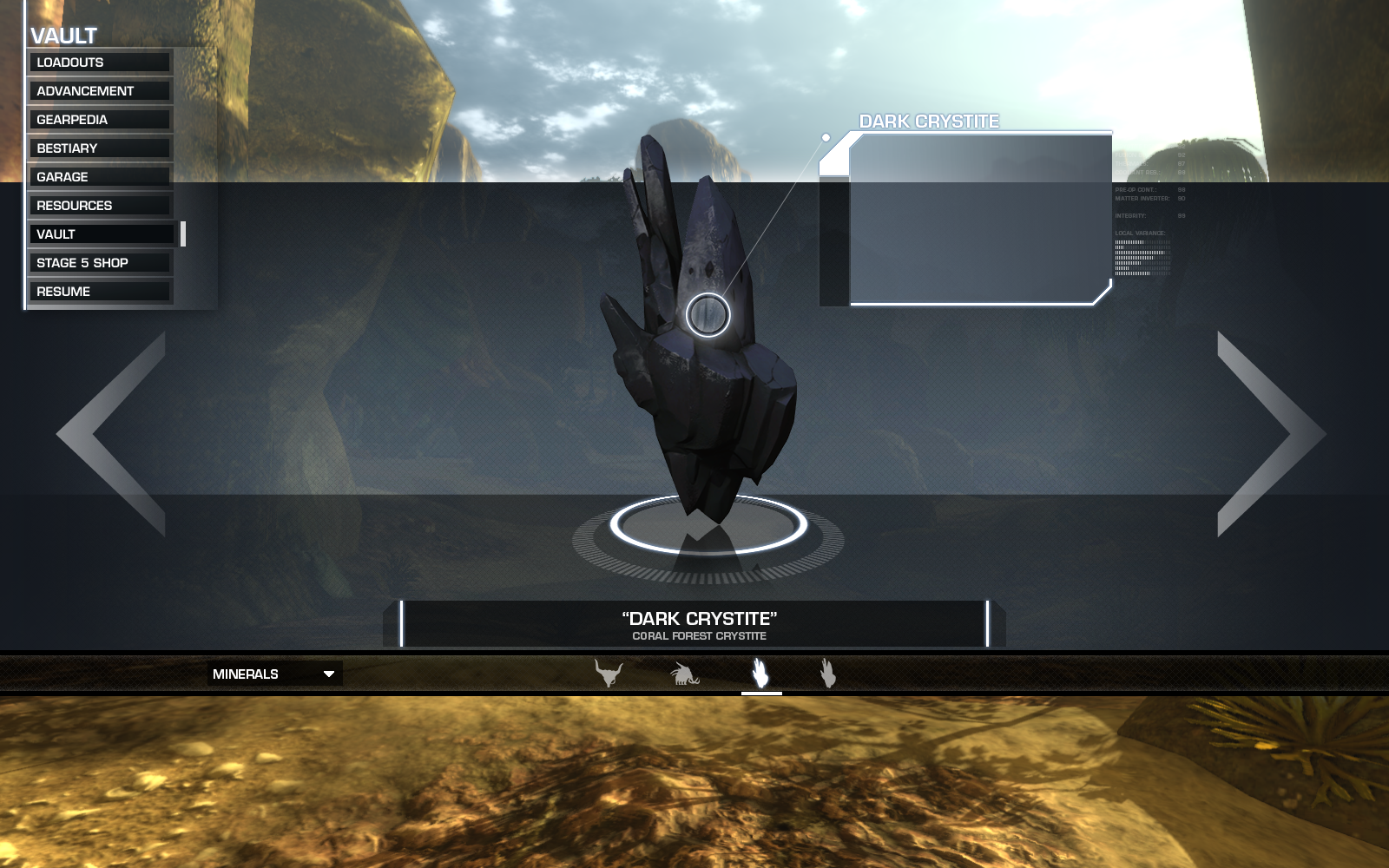
menu designs
Various blockouts and explorations of different required menus in the game.
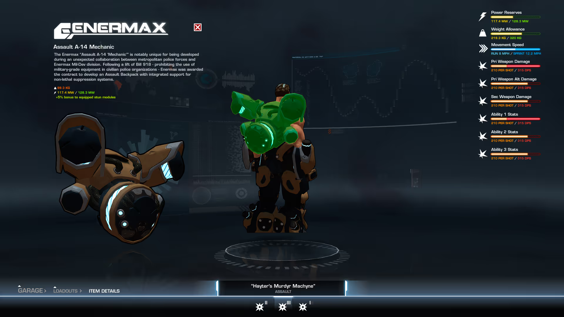

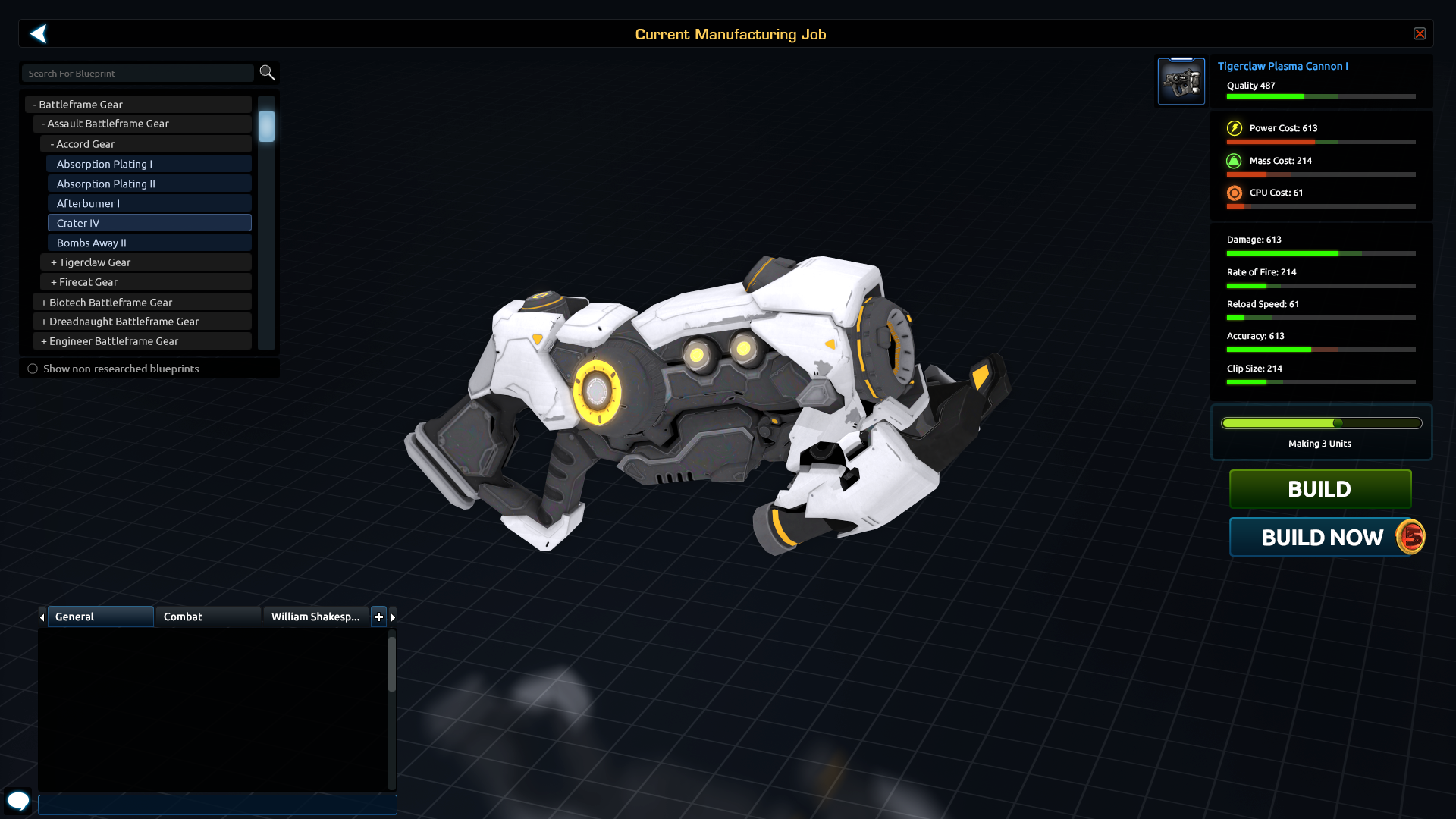
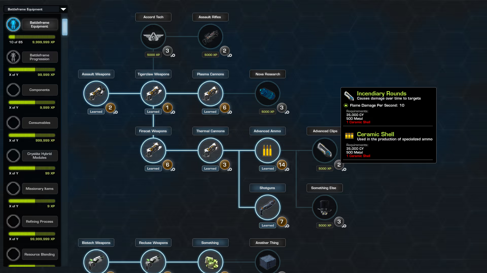
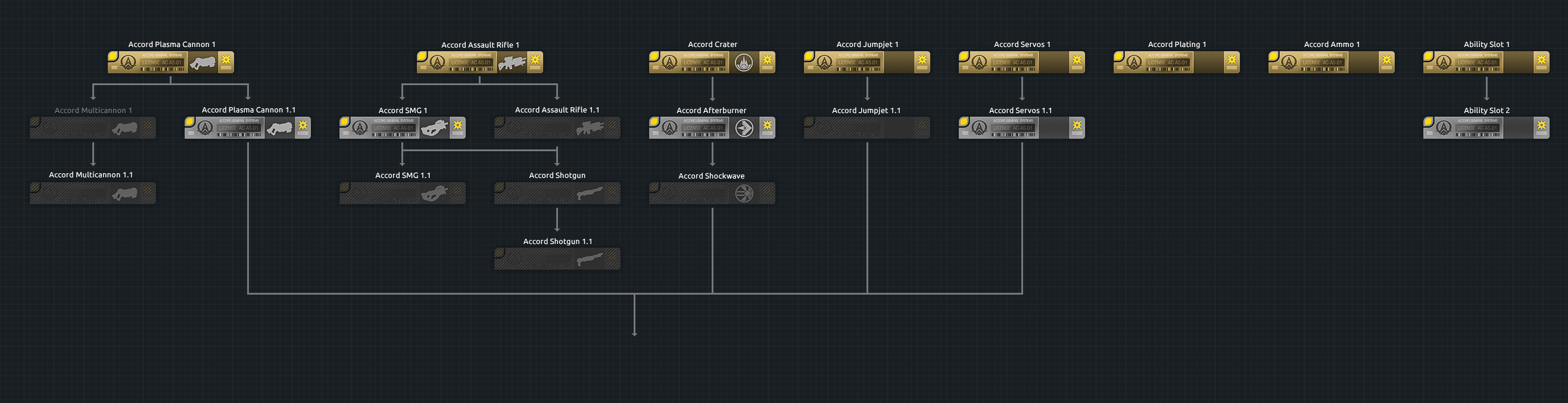
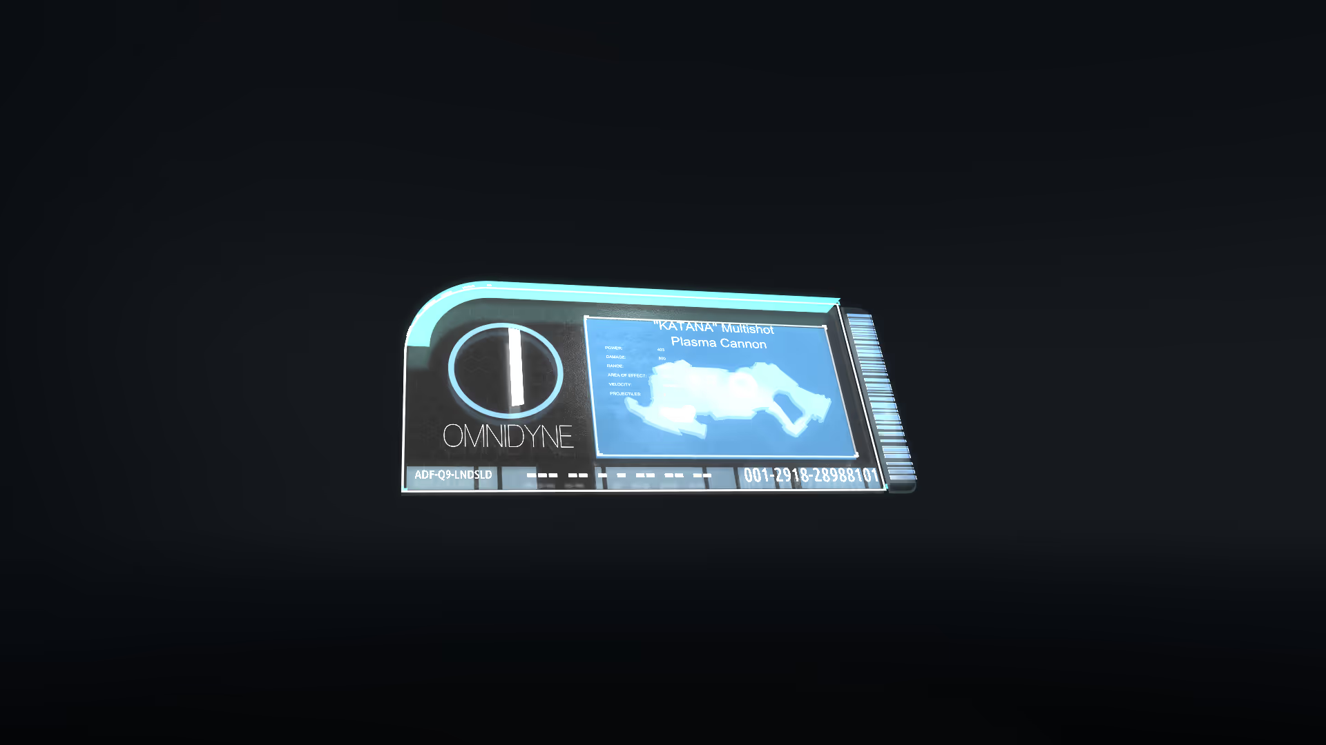
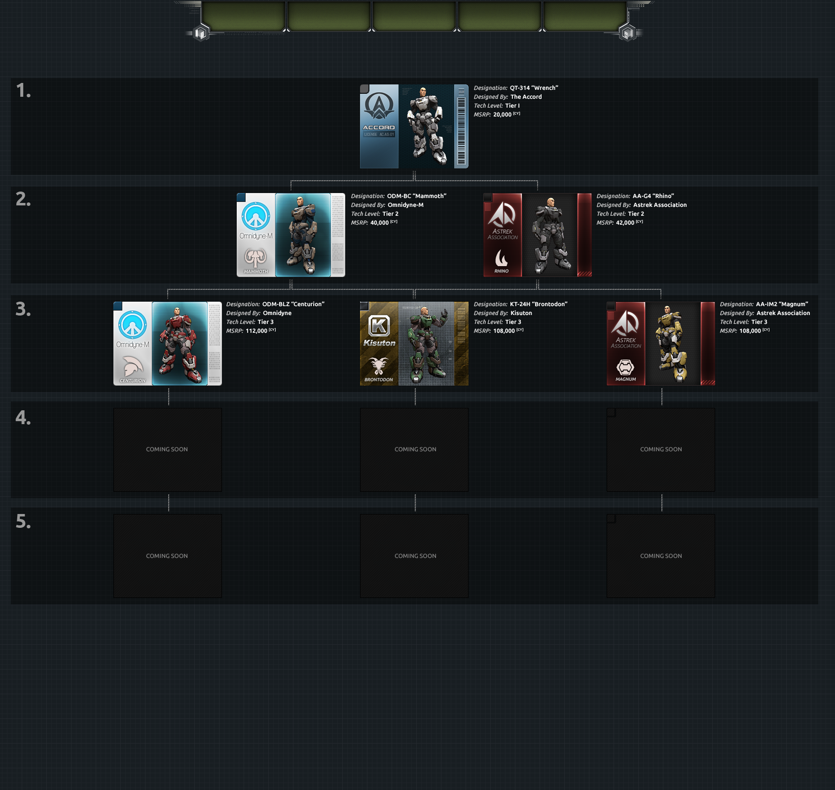
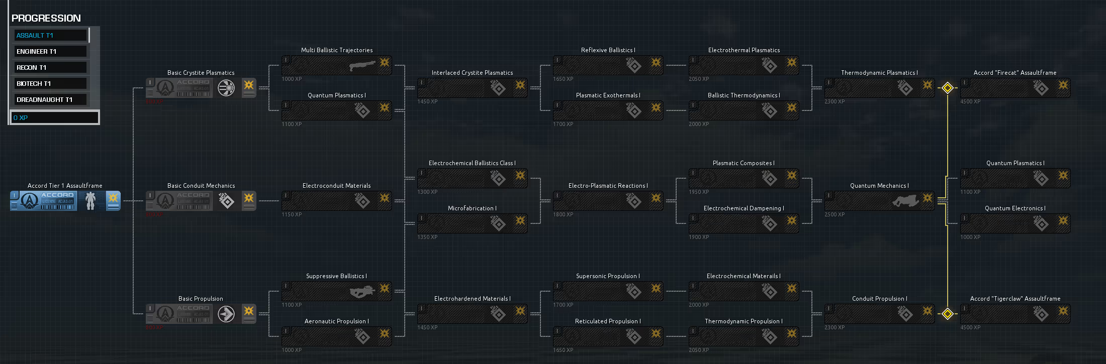
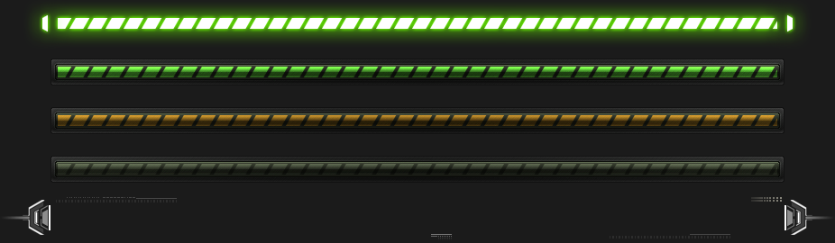
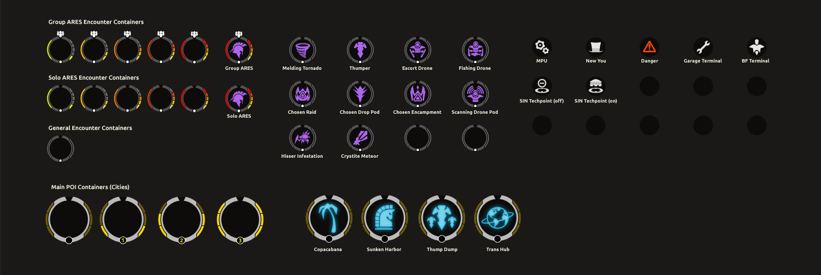
miscellaneous
A few in-game branding items, some tech trees and their contents, and a few miscellaneous UI elements.